Motion Design Showreel - 2026
Competition Winner
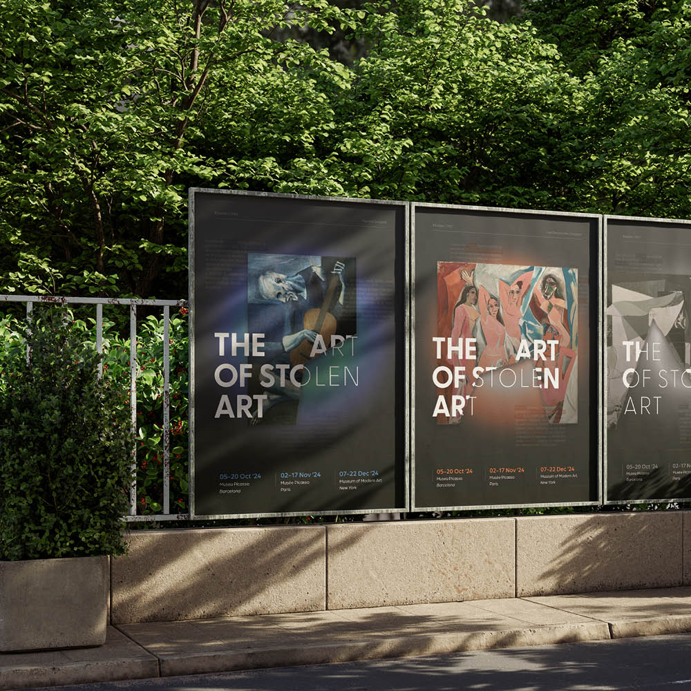
The Art of Stolen Art
The Objective
This project was the final assignment of my Graphic Design studies at SyntraPXL. The goal was to develop a complete visual identity for a fictional exhibition where digital and analogue art experiences come together.
Explaining The Wordmark
The exhibition title, The Art of Stolen Art, has a dual meaning. It refers both to the literal theft of artworks and to Picasso’s famous quote, “Good artists borrow, great artists steal.” Picasso was chosen as the central figure because his works are among the most frequently stolen in history.
A modular logo was designed as a core element of the identity. Inspired by a missing fragment removed from an artwork, the logo symbolises the loss and incompleteness caused by art theft.
"The logo, inspired by a missing piece stolen from an artwork, symbolises the loss and incompleteness caused when part of an artwork is taken away."
Visual Identity
The colour palette reflects different stages of Picasso’s life: blue tones reference his early struggles, vibrant colours represent his rise and creative energy, and grey tones symbolise his later years.
The key visuals combine the logo, featured artworks, and dramatic light effects to create a flexible and emotional visual system. Multilingual news snippets about stolen artworks add narrative depth, with highlighted words revealing the exhibition’s central message.
2024
Branding
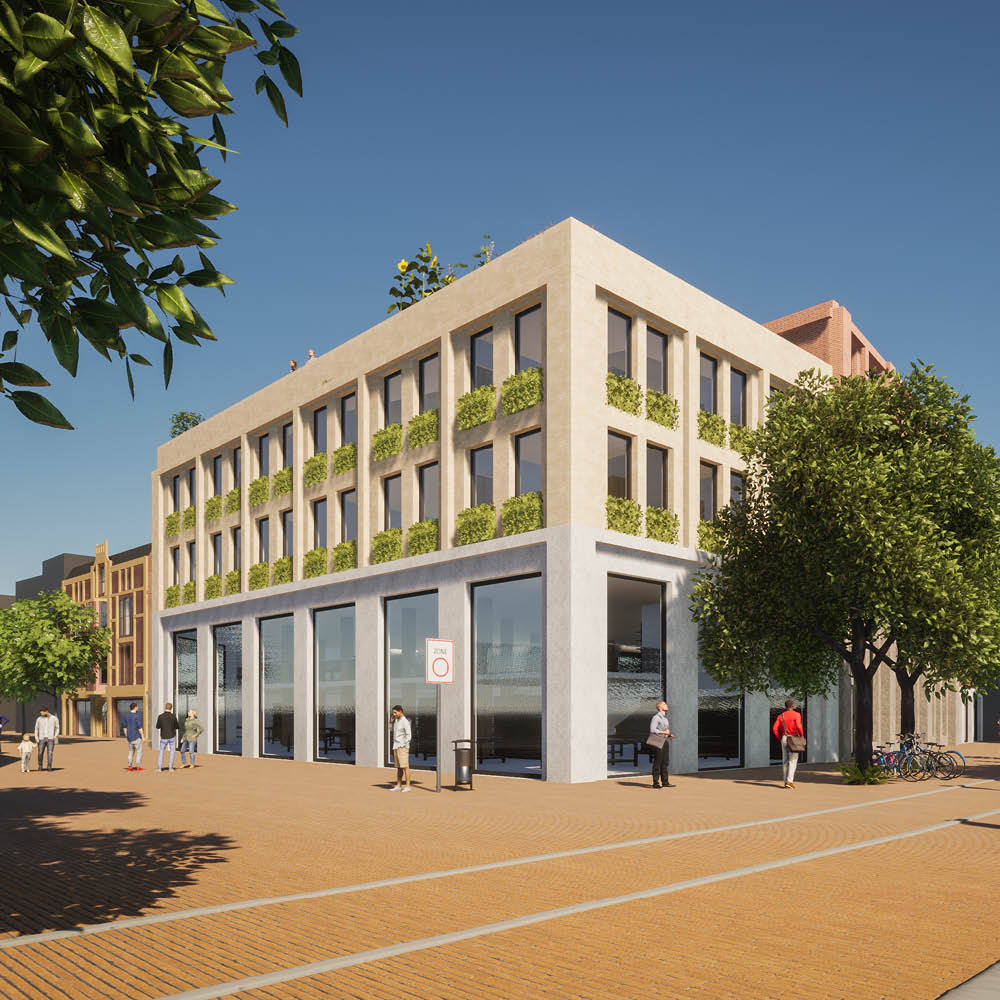
Friggehof
The Assignment
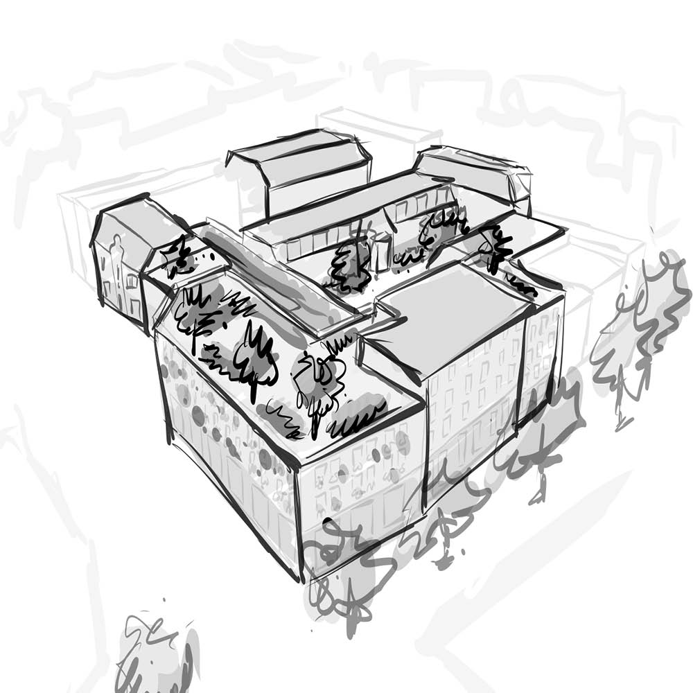
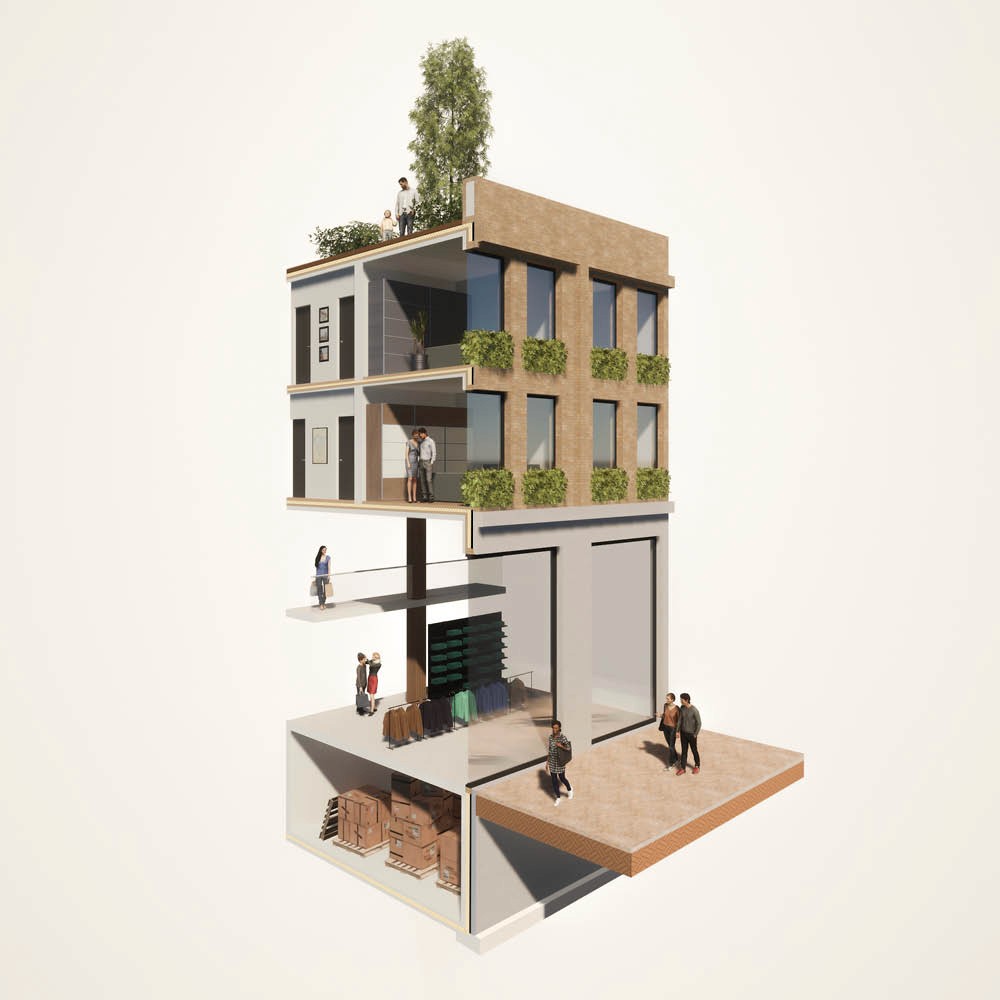
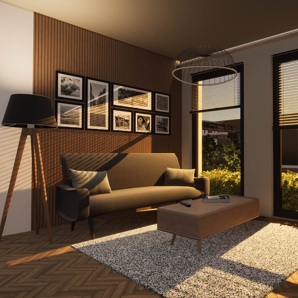
As the final project of my Bachelor's degree in Architecture, I was tasked with designing a new mixed-use complex on an existing city block in Groningen, The Netherlands. The development needed to combine residential, commercial, and community functions within an urban setting.
Main design theme
Named Friggehof, the project is located between Herestraat and Gedempte Zuiderdiep. The name references the historic Grand Hotel Restaurant Frigge, which occupied the site until 1980 and remains part of the area's identity.
The design centres around a public square that serves both residents and the surrounding neighbourhood. By combining housing with community-oriented facilities, the project aims to strengthen social interaction while balancing public and private space.
Functions such as retail, a lunchroom, childcare facilities, and a community centre create an inviting environment that encourages connection and everyday use.
"The design centres around a public square that serves both residents and the surrounding neighbourhood, strengthening community through shared space and everyday interaction."
Material use
Brick and granite form the primary material palette. Granite is used in the plinths of buildings with public functions, while brick reflects Groningen's architectural heritage and historical urban character.
Through its morphological approach, clustered building volumes, and contextual material choices, Friggehof integrates seamlessly into the existing streetscape while establishing a strong sense of place.
2023
Architecture
Scala Digital Signage
Current Role
I currently work for Scala, a global leader in digital signage solutions.
As Lead Product Designer, I am responsible for the design and optimization of Quintet, the company's next-generation software platform.
My role involves shaping the product experience, improving usability, and helping define the future direction of the application in close collaboration with cross-functional teams.
Due to confidentiality agreements and the ongoing development of the platform, further details about this project cannot be shared publicly at this time.
2026
UI/UX
My name is Chiel Webers,
I am a 25-year-old motion and graphic designer based in Sittard, The Netherlands. I was raised in a family full of designers and entrepreneurs and got in touch with the creative business from an early age. Now it’s time for me to make a career in the industry.
Education
2019 - 2023
Syntra PXL Graphic Design
2023 - 2024
Professional Experience
Studiomarq
Motion & Graphic Designer
May 2020 - March 2025
Liswood & Tache
Intern Motion & Graphic Designer
April 2024
Scala Digital Signage
Lead Product Designer
April 2025 - now